Legibility's Editorials
by Matthieu Cortat, Marie-Mam Sai Bellier

Matthieu Cortat in Revue Diorama No.1, Legibility, p.23.
“The eye is not only nourished by legibility”. Let’s take Fernand Baudin at his word. Food for thought, food for the eye. Otherwise: death. Legibility might be compared to bread, rice, millet or seal fat, as you wish. The main part of its nutrition, with “clarity and transparency” as its main seasoning. Salt and pepper.
The struggle for life could be satisfied by those three characteristics. But they’re not satisfactory to everyone, or everywhere. Of course, there are people delighted by strict diets, vegan, salt-free, gluten-free, and mostly pleasure-free diets. They must love Univers, while waiting to be fed by pills and to read using brain implants. Could the prohibition of certain food be compared to a Crystal Goblet typography? One might certainly find online a kosher or halal font. Let’s be careful, and avoid reversed contrast during Lent. Feces in Ikea chocolate fudge and Photoshop in film photography.
This first issue of Diorama is highly epicurean.
The menu is long and rich. You will find here, among others, Marcel Mrejen’s tropical fruits, Annija Grīsle’s Mittel-Europa pickles, Alexis Cros’ chili crisps, Audrey Quaranta’s cherries, Paul Andali’s bananas, Louis Brousseau’s Rugelach, Valentin Defaux and Camille Jacoby’s fish plate, Floris Dutoit’s ice creams and chocolate, Claire Barrault’s candies, Alice Savoie's HP sauce, with a drop of pure water by James Langdon. Finally, a mint by Roxanne Maillet.
Fortunately, the eye has far less problems with digestion than the stomach. Should you be overwhelmed by such profusion, you can always take a break and start reading Diorama later. So, there is absolutely no reason not to enjoy the feast.
Bon appétit.

Marie-Mam Sai Bellier in Revue Diorama No.1, Legibility, p.23.
The Diorama’s project was triggered by an incoming fascination for display typefaces and their history. Asking myself a way to use these letters full of stories, I quickly noticed all the complexity and the freedom aspects that their use implies and inspires. This reason encouraged me to share this thought in an epistolary way, illustrated by a quote of Fernand Baudin from his article in the magazine Communication et langage n° 35 (1977): “One must admit: Whatever the taste that one has for legibility, clearness and transparency. It isn’t always sufficient, and not always for everyone. The eye isn’t only nourished by legibility but by all of the letter’s beauty. It could not be clearer.”
I designed a poster where I drew two emerging clans about this notion of legibility (p. 20-21). Operating with a principle of correspondances, this sentence was widespread to some guests by emails and envelopes. The journal displays a compilation of the collected answers.
Revue Diorama is following in the footsteps of 1970s international type specimen newsprint and type foundries journals. A way to show and promote display “characters” — I like the ambiguity of this wrong translation of the french word for “typefaces” — drawn by our studio, by associating them to a chosen content proposed by contributors related to the image fields either from near or far. Presenting in a particular way, the diorama of their individual practices, in reaction to a chosen theme, confronting all of these points of view. Diorama focuses on its definition itself, on ways to displaying, to read and expose.
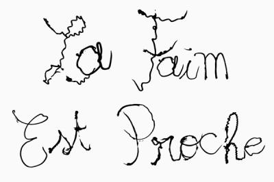
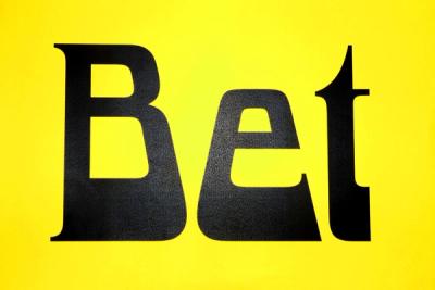
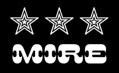
It was above all, thanks to the generosity of every contributor that the first issue of Diorama was able to be launched. I also thank my partner Guillaume Sbalchiero for his accompaniment during the creation of the project, the editorial and graphic conception, also for his typefaces Bet which dresses the logotype and the pages for this first issue and Twen for the chapter divisions, next to the Mire. Thanks to Clara Pasteau for her Fondante lettering, born from an interesting curiosity for lettering in pastry, investing ponctually the binding with the words from Fernand Baudin. The relationship to taste, ornament, adornment, which applies in the field of advertising typography since its creation in the XIXth century, were all major references in the design of this collection of typefaces for this first issue Legibility.


